Project
-
Redesigning Microsoft's Newsletter
Client
-
Microsoft
Role
-
UX/UI Designer
-
Visual Designer
Team
-
Stakeholders
-
Project Manager
-
Marketing Team
-
Programmers
My Approach
I met with the client to set up our priorities and answer the questions like, What's the goal they want to achieve after this revision? What is it that our users want to get out of this newsletter? and is there any style they have in mind?

Content Hierarchy
Auditing the Current Design
What can be improved in the current design?
-
Visual hierarchy and focal point to help the user's eyes.
-
We can improve engagement by humanizing the newsletter by adding face photos or illustrations.
-
The current design is text-heavy and not easy for the user's eyes to read.

Current Design
Content Hierarchy
I synced with the content strategist to decide on the content hierarchy before I designed the wireframes.


Design Suggestions for Internal Review
Based on this information, I started redesigning the layout based on the content hierarchy. I prioritized visuals based on the editorial interest. I presented a few options, explaining how each design works, the design goal, and how they solve the user’s problem. I designate areas for different content categories that are consistent each month.
I chose a modern and dynamic style since our client's references were all modern designs with limited color palette illustrations.
Next, I explained some of my solutions:


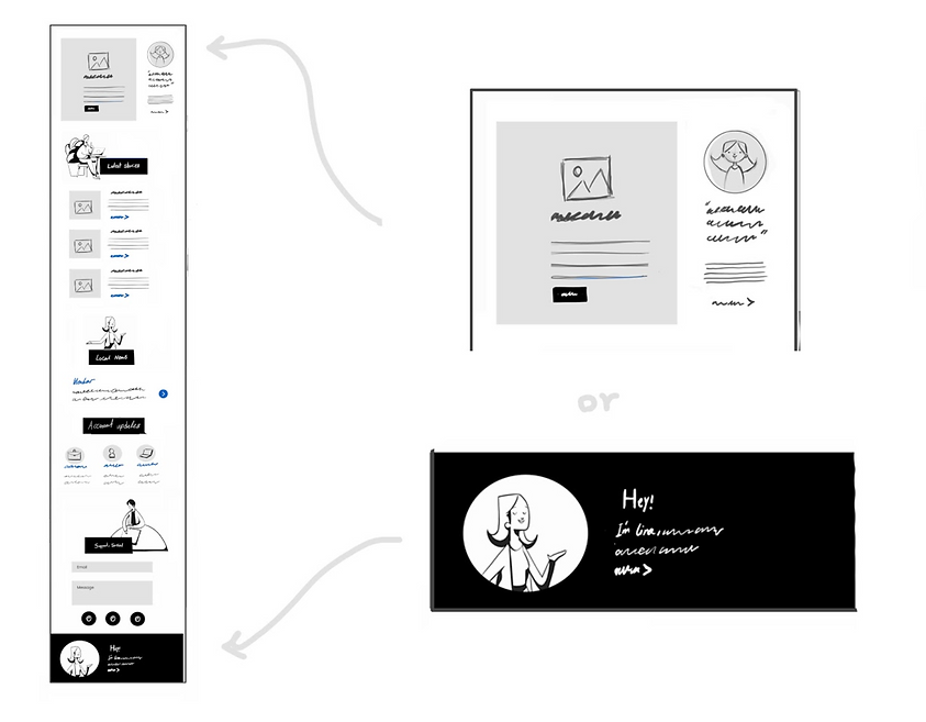
01- Using Elaborative Illustration
Helping users to get an idea about the subject through pictures and/or illustrations.

02- Author's Avatar
Top of the page: next to the hero image, it may decrease the impact of the hero image, but it humanizes from the beginning of the newsletter.


03- Flexible Layout to Meet Each Month's Needs
Creating a flexible and responsive layout in which we can add more stories/content to each section based on that month's needs.
Wireframes for Clients's Review


Creating Visuals for High-Fidelity Design
After a few iterations with internal and client feedback, we decided to test 3 different options
with our actual users. Our primary focus was the task completion rate to measure our success.


Presenting Few Options
-
Version A: Using elaborative illustrations, create a fun and friendly design for the newsletter. Inspired by the New York Times newsletter.
-
Version B: Using Microsoft's library's photos to create a more formal looking for our audience. It can be a good choice because of our audience. ( Mid-senior level managers and business owners )
-
Version C: Combining pictures and elaborative illustration, add more formality to the newsletter.

Version A

Version B

Version C
Design Results
I have set up some indicators of success to understand how I can measure success, some examples are:
-
Scroll Rate: We measured how thoroughly our audience consumes newsletter content by tracking where on the page they stop reading.
-
Click Rate: Analyze CTA click-through rate
-
User Engagement: The average session duration or average time spent on the newsletter
Based on the early User Testing results, we went with option C, which was a combination of elaborative illustrations and photos. Version A had the highest scroll rate. However, version C had the highest click rate and user engagement.


