Research
Redesigning a website that has made to guide and educate young female entrepreneurs.
Current Version
Design Timeline
One week
-
UX specialist
-
Visual designer

Identify Business Goals
Bringing more students ( 10 students per semester )
Increasing the subscriptions
I created a questionnaire and I interviewed with open-ended questions.
The goal of my research was to determine what our potential users are looking for, what they are already using to meet their needs and what they would like to the user, but they haven’t found it on our competitor's websites.
8 of 10 people wanted to have a coach/mentor without crazy costs.*
5 out of 10 were also looking for inspiration on a daily/weekly basis while getting the necessary information.
*I asked them what high rates mean to them, most of them agree that $100-200 per session is a high rate.
Role
Project Details

Customer Decision Path
Perceive Need
Identify Options
Convince/creating trust 1, About
Convince/creating trust 2, reviews
Action/convert
We want to make sure that there is no ambiguity in our labels, to find what they are looking for in a glance.
Category, subcategory, buttons
Choose clear, known ( don’t create words! ) and simple words and terms
-Is that what our customer would call it?
-What category would users expect to find that in?
-What’s the action they’re actually taking when thy click this button?

Color Pallete
Since color has the power to evoke emotions, encourage conversions and even generate brand loyalty when used correctly, it’s not something we can look at as a last-minute decision. By assigning a brand identity color palette to our website, logo, and business materials, you’re subconsciously creating psychological connections with our audience.
A sense of feminine and growth, representing a female founder who wants to grow.
I chose pink to convey the feeling of being feminine, also I added green to create a feeling of aliveness and growth.

Illustrations
I wanted to create the illustrations in which characters will reflect the nature of the growth and power while keeping the feminine vibe in my designs.
The first stage of my task required creating the set of sketches of strong poses for women who are doing business activities.
Original characters help to make the interactions more human-like, set strong visual associations with the real world and instantly transfer the needed mood. What’s more, depending on the composition, the characters may become an effective tool to make the page or screen dynamic and lively. That was the case for this project.


Digitizing The Sketches
Having discussed the hand-drawn sketches with the client, I made one of the digital and presented in two color palettes based on the chosen color palette and its shades.


Visual Design Goals
-
Clear and Well-Structured:(Important elements should be easy to scan )
-
Consistency: leverage the usability by creating uniformity
-
Simplicity: (Making the website fun and engaging yet simple and consistent)
Wireframe
Padding

Typography


Buttons


Default
Hover
Clicked

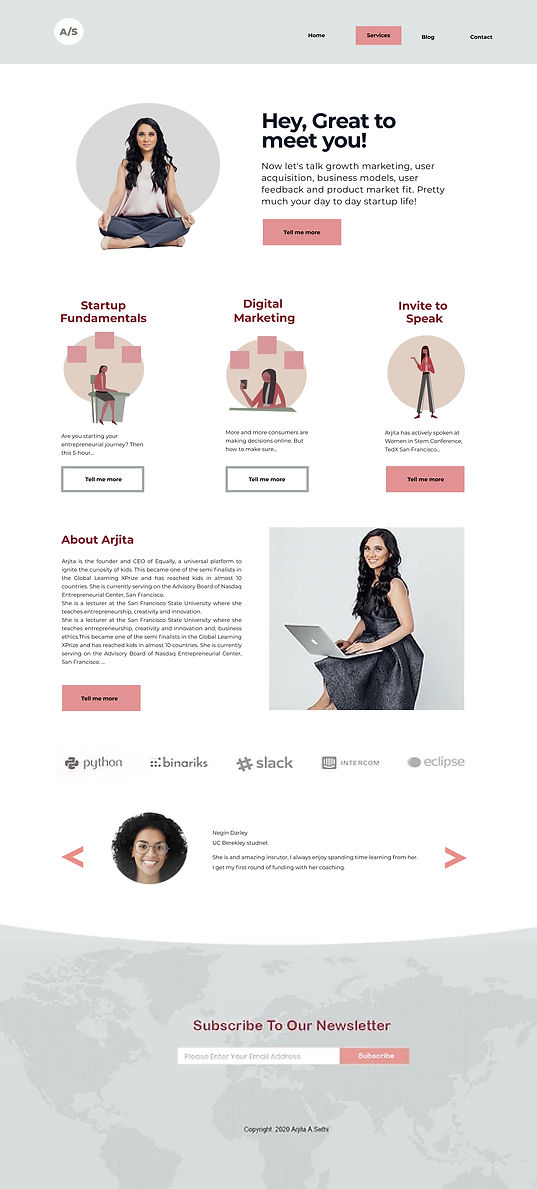
Final Design


